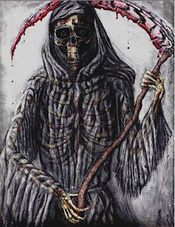

collection of my work over my course

Posted by CMDIPLOMA Tuesday, 21 April 2009 at 03:32


0 comments Labels: evaluation, film opening project
Posted by CMDIPLOMA at 02:05

my first key frame is the first shot in the sequence and i like it because of its framing. i like the way the camera tracks from the centre of the barrel and slowly moves out of it, keeping the barrel in the centre of the shot. it reminds me of the title sequence of twelve monkeys and it is where i got the idea for it from. twelve monkeys is a very fictional mystery story which is what reaper is so the shot kind of ties in with that.
my second key frame is the shot of the bomb shelter. i like it because of the lighting. the way the shot starts dark an then slowly gets lighter looks visually stunning. the shot took a while to set up because the windows on the left side had to be in shot as well as the door at the end. i really like this shot and i think that the lighting is fantastic. it did take a while but it was worth it.
my third key frame is of an old defense wall. it wasn't in my storyboard but i thought it fitted the narrative better than some of the othershots. i like this shot because of the setting. it really feels secluded and dazzling visually.
my fourth key frame is the shot of the army vehicle and i chose it because i like the narative behind it. the idea behind reaper was that he was a war veteran so the fact that there's a shot of an army truck ties in with his past and fits the storyline perfectly.
my fifth key frame is a pan shot of bomb shells, and i like this because of it's camera movement. i did numerous takes of this shot during filming and the first one was the one i was most happy with.
my sixth key frame of the oil drums and such was chosen because i like the transitions. i think that the fade in and out looks really well done in this particular shot. the contrast effects i put on the shot itself looks fantastic as well. it looks really grittyand the colours remind me of that of sin city. very bold colours but look really earthy and almost dirty.
my seventh key frame is of the gas mask and i chose this because i like the props in the shot. i borrowed the gas mask from one of my friends and it works perfectly with the storyline and the past of the main character who used to be a war veteran. the gas mask reminded me of the doctor who episodes with the little boy and the gas mask. that was filmed in world war 2 london so i thought that using a gas mask that looked similar would help show audiences that hes a war veteran.
the eighth key frame is of the ground leading up to the hand scene and i chose this because o the effects. it isn't a floor at all, it was actually a work surface covered with leaves but you wouldn't be able to notice with out me saying so. it took a while getting it ready before filming but i'm very happy with the results. it fooled everyone i've shown so far and thats what i wante to achieve.
my nineth key frame is of the film title and i chose it because i like the typography. i think the font i chose stands out and at the same time looks epic which reflects the main character in a way and the film because the story behind it all is very far fetched on a big scale. the way the title comes in is a bit like the waythe titles come in for harry potter films. the fade in and zoom effect works well to draw your attention to it. i think it works well in my film.
0 comments Labels: evaluation, film opening project